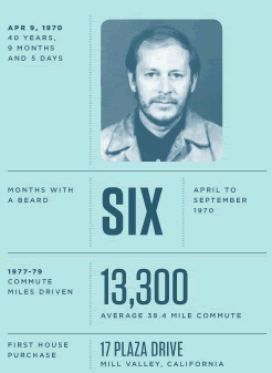
With plenty of images and links to important thinkers and practitioners, including Edward Tufte and Nicholas Felton, Larson gives a historical overview of where inforgraphics come from, how they expose and distort meaning, and how “data visualization is the emblematic medium of our times.”
I remember speaking with Tufte after a presentation he gave at Artists Space in 2000. It was soon after the contentious US Presidential election and it had become painfully apparent that some of the poorly designed “butterfly” voting ballots may have caused confusion and fooled citizens into voting for the wrong candidate. He lamented the state of governmental graphic design and the inability of some municipalities to understand the importance of graphical presentation when so much is at stake.
