Light and Dark


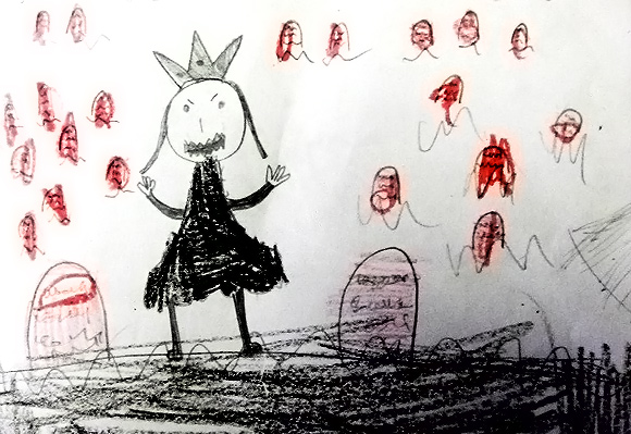
I'll never forget the time I was setting up class when a student ran up to me and excitedly thrust a picture he'd drawn at home in front of my face. In the center was a crude image of an airplane engulfed in flames flying directly at a high mountain. To the right was a smiling boy parachuting out of harms way. "That's me!" my 3rd grade student exclaimed. "But who is that?" I said, pointing to the two horrified faces looking out the windows of the doomed plane. "That's my sister and my mom!" he said with a smile. I caught my breath and didn't know how to react. I was just a 22 year old art grad teaching at a local recreation center. I knew how to encourage children in their positive artistic pursuits but had no idea how to deal with such a dark vision. His sister sauntered into the room and slumped in a chair as the other students wandered in. I took the image from the boy and put it on a high shelf in a cabinet. "That's not a very nice way to picture your family. They look like they're going to get hurt," I said. "You can have the picture back after class." He scowled at me and retreated to his seat. When their mother came to pick them up an hour later I showed her the picture and explained what it depicted. She was taken aback. "That's mean!" she yelled to the boy. "You love your sister!" She thanked me for sharing the image and dragged the two out the door with the picture clenched tightly in her fist. More

Drawing People in Public

Hoboken Council Meeting
I've been challenging myself to draw faces whenever I have a chance. It's rewarding to find the characteristics that make us look different and see how expression and personality manifest themselves in outward appearance. Above is a recent drawing I made of some of the members of Hoboken City Council. More

We’re Gonna Need a Bigger Board


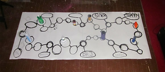
My game and mapping class is coming up in May at Hoboken HOLA and today I put together a sample game board to prep. One of my studio mates gave me a piece of photographic seamless paper so I figured I'd try enlarging the game board idea to full table size. I figure a 9'x4' piece of paper will keep 8 kids occupied drawing mazes. They would each draw a home base and five game spaces. Each section would connect to the next, forming a large loop of about 40 spaces. More

The Endlessly Contorting Escher Girls

It seems that when women are depicted in action comics their spines turn to rubber, their breasts inflate and their feet taper to sharp points. Such is the world depicted by Escher Girls, a Tumblr that surfaces the most ridiculous depictions of female anatomy found in the latest comic books. The signature move on the site is the "Boobs & Butt Pose". This awkward maneuver allows the comic artist to render both the spherical breasts and the firm buttocks of his fantasy babe into one dynamic, über-sexy mass of body parts. The end result can look ridiculous to anyone with any familiarity with human anatomy. While the images usually depict the character fighting, the stance is completely unstable and not conducive to good attack or defense.
Some of the funniest posts swap male characters into the female poses and costumes to show just how ridiculous they are. Women in comics are often rendered as submissive tarts, contorted to the demands of a man's eye, while male characters are depicted as throbbing, steroid-pumped hunks of tense muscle. When the roles are switched the results can be hilarious.

Welcome to the Jungle

Here's the trailer for Minecraft 1.2. There's a new jungle biom, children and wolf cubs. Plus much more, I'm sure. Hoboken Minecraft: SW at Observer & JacksonI've been constructing a replica of the southwest edge of Hoboken in Minecraft creative mode to get a better idea of the spacial relationships, traffic patterns and building footprints of an area that is under consideration for redevelopment. As of February, 2012 I serve as 3rd alternate member of the Hoboken Zoning Board of Adjustments. More

Quiet and Reflective

Susan Cain, author of the book Quiet: The Power of Introverts in a World That Can't Stop Talking offers an insightful analysis of how we understand and often misinterpret introversion in children and adults. For example, just because a child is doesn't participate in a "Mommy and Me" type class at a young age does not mean that the child is not paying attention and doesn't benefit from listening to music and observing others. She applies this to the business realm as well, showing that great ideas don't always come from loud, crowded brainstorming sessions but often come from quiet, reflective analysis by individuals of the problems at hand. On her site she offers a 16 point manifesto. I like number ten:
Rule of thumb for networking events: one genuine new relationship is worth a fistful of business cards.
Via Brain Pickings

The Invasion of Charts and Infographics

Section of The 2010 Feltron Annual Report

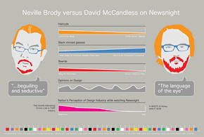
Reif Larson at The Millions recently posted a fascinating analysis and critique of the different ways our media inform and misinform with visuals, charts and infographics. Tucked within his essay is a review of the book Visual Storytelling: Inspiring a New Visual Language With plenty of images and links to important thinkers and practitioners, including Edward Tufte and Nicholas Felton, Larson gives a historical overview of where inforgraphics come from, how they expose and distort meaning, and how "data visualization is the emblematic medium of our times." I remember speaking with Tufte after a presentation he gave at Artists Space in 2000. It was soon after the contentious US Presidential election and it had become painfully apparent that some of the poorly designed "butterfly" voting ballots may have caused confusion and fooled citizens into voting for the wrong candidate. He lamented the state of governmental graphic design and the inability of some municipalities to understand the importance of graphical presentation when so much is at stake.

Quieting Down the Classroom

I find that my elementary school classes can be a bit noisy. It's partly because the kids have been in class all day and drawing is after-school enrichment. It's probably also because I talked a lot in school and I have a relaxed attitude toward letting students converse with their friends. When I was in 3rd grade I had a teacher who sent notes home every week complaining about my mouth. Eventually my parents pulled me out of that Catholic school and sent me to the public school down the street. Luckily the new school had a teacher who saw and supported my interest in drawing and art and I had a much better time. But now I find I'm on the receiving end of being talked over and ignored by groups of 2nd and 3rd graders. While I hope the kids enjoy my class, I do need to keep it all in check or I wind up with a rising din of noise, distracted students and a bunch of half finished drawings at the end of class. Charity Preston posts articles and videos for her Organized Classroom blog and the video above outlines her technique of using red, yellow and green cups to keep the noise in check and let the kids know when they've become too loud. It seems like a smart method and I'll have to see if I can make it work.