Buy the print at my shop on Society 6.
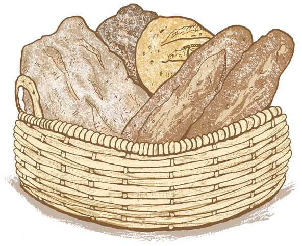
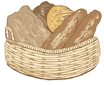
I drew this bread basket while having a coffee at Choc-O-Pain cafe in Hoboken. It’s a simple picture but I’m really excited about it because I was able to really nail a technique I’ve been working on the past few months. The picture incorporates a combination of ink line and sumi brush work with color in Photoshop. Below are some of the steps I went through.
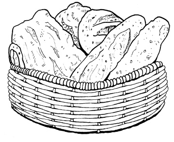 1. This is the drawing I did freehand at the cafe. I sketched the basket in pencil, then outlined everything in pen. My initial drawing used simple indications of the basket pattern which I later completed at home.
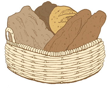 2. I scanned the ink drawing into Photoshop and filled in the major color areas. I also used a color overlay blending effect to change the line color from black to a warm brown.
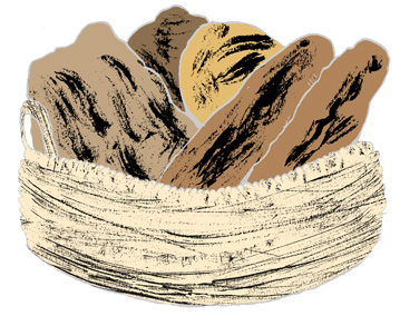 3. I printed the outline and put the drawing on my light box. Using a dry brush and thick ink I played with the texture of the different pieces of bread. I was going for rough brush strokes to indicate the creases and pockets of the bread.
 4. After scanning the brush textures into Photoshop I reversed them to white, then applied a color overlay to each individually. This allowed me to match the underlying color of each piece of bread.
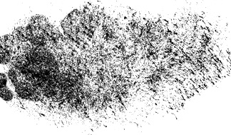 5. For the flour I dipped my sumi brush lightly into the ink and repeatedly jabbed it onto a piece of paper until it gave me the spotted texture I was looking for. On the computer I inverted the black and white, then used the “screen” blending mode to allow everything that wasn’t white to be visible below.
 6. Finally I gave a quick brush stroke to indicate the shadow underneath. Again, this was colored in Photoshop and applied in a layer behind the basket.
One of the reasons I’m excited about working this way is that it allows me to use dynamic brush strokes while giving me control of color through Photoshop. I’d previously tried using ink wash with different layer blending modes but wasn’t able to get the right effect with my layering. For the bread basket I worked with each layer as a 2-bit image, meaning the pixels on each layer were either black or white, no gray. I loved the rough feel it gives the line work and the control it gave me of how each layer looked when stacked with a color overlay. It also means I can easily scale the artwork up in size if I need to, so long as I turn interpolation off and accept the hard pixel edge look.